Once a charm, now a design element; but John Billingsley considers if the crossed W has become a subconscious metaphor of its traditional symbolism?
In NE165 we asked for readers’ impressions of two varieties of the letter W, and this article reports on our feedback as well as suggesting how the image aspect of design can exert a level of meaning that may outlast the typographical.
The typical form of the Marian Mark, associated with the blessing virgo virginum,1 is a W made up of crossed Vs: W, known as the crossed W. The holy connotation is enhanced by the X contained at its heart. It can also, less commonly, appear as double Vs, i.e. VV. The sign has been used as a talismanic blessing and as an apotropaic device. Like other symbols and devices designed to avert ill fortune, it appears at places considered to be thresholds of one kind or another, of an either mundane or metaphysical nature. It is found in caves − e.g. Wookey Hole, Creswell Crags −, on church fabric, door jambs and various locations around old houses, boundary stones, and also on corpseways.2 It was presumably executed when such a blessing was deemed necessary, perhaps because of an uncomfortable atmosphere at a location, or at an interface of the outside world with the subterranean or sacred, as in caves, mines or churches. It is self-evidently at root a Roman Catholic sign and is found across the European Catholic range. This included pre-Reformation England, and it is a common feature of mediaeval church graffiti. However, the sign persisted in Britain even after the Protestant Reformation, which eschewed such superstitious usages as blessings and reduced the role of the Holy Virgin. Continuity of a generation or two after the break from Rome in 1537 can be expected, as breaks in long-established custom take time to work their way through a traditionally-minded population. In England’s case, the changeover in popular usage was inevitably delayed thanks to the accession of Queen Mary and her attempt to return the country to the Roman variant of Christianity.
Nonetheless, the indications are that W persisted as a generalised protective rather than a specific Roman Catholic charm; both W and VV persisted as apotropaic graffiti, albeit declining in later centuries. W in particular transcended this usage, becoming a frequent stylistic feature in a variety of contexts from mason marks to a London Underground typeface. It has aesthetic appeal, managing to combine simultaneously elusive impressions of antiquity, showiness and dignity. I first noticed it as pre-Reformation church graffiti around the country, then as graffiti on domestic architecture in early modern buildings, then frequent (but not exclusive) usage on West Yorkshire gravestones of the mid-18th century, and on late-18th century mason marks on canal architecture in the same county. Along the way I have also encountered undateable examples in caves at Wookey Hole3 and Creswell Crags4 and mine-workings at Alderley Edge. Recently, I was alerted to the use of W in station signs on the London underground c.1924-1932, such as Aldwych, a usage which gave rise to a nomination as a Design Icon: “The crossed W design is different and striking … the design is beautiful but functional and certainly enlivens and provides an interesting difference in typography to the signs it adorns”.5
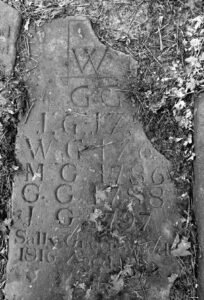
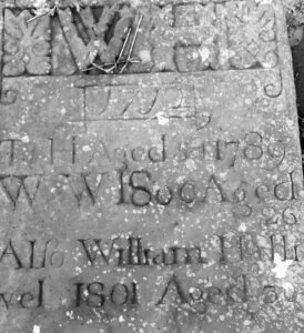
It was the 18th-century gravestones that first raised a question in my mind, for like the above quote the crossed-W generally presented a variation to other lettering on the same gravestone, and therefore stood out as distinctive. The letter appeared only in what we might term ‘header’ contexts − enlarged initials, usually with a year or an accompanying decorative image; on the same stones, however, the name of the deceased as well as any other instances of W were executed in a standard fashion. The illustrations will convey this; the crossover is accentuated in the ‘headers’, but only alluded to in the standard inscriptions. I had previously assumed the crossed W to have been a standard usage at that period of history, but the gravestones indicated that by this period it seemed to have been commonly preferred for certain usages. Of course, further exploration of early modern churchyards is essential to gauge whether this association holds, and whether any geographical variation exists. I anticipated some exceptions to this tendency, featuring W in all contexts, and it was duly so − but these equally tended to be earlier, 17th-century graves, suggesting a potential separation of usage occurring around the early 18th century. More exhaustive investigation might offer more understanding or rejection of the association; in the meantime I advance these thoughts as hypothesis, for observation and discussion.
Mediaeval typography was developed first in Germany, with the invention of the printing press by Johannes Gutenberg in the 15th century, and from this emerged the earliest typefaces, the ‘gothic’ textur or blackletter forms. The spread of printing across Europe produced typefaces deriving from other cultural traditions, and Italy, naturally enough, looked to Roman lettering, and derived types now known as antiqua − the inscription on Trajan’s Column in Rome provided a base form for capitals.6 One problem for some languages, however, is the Germanic W, which did not exist in Latin,7 where the sound was provided by the pronunciation of V; hence Trajan’s Column could not provide an exemplar, as in other lettering. The ingenious way around this was to combine the letter and pronunciation as an amalgam of the Roman V, i.e. the crossed W. This was essentially a Renaissance development, and appeared in typefaces designed by the Venetian Aldus Manutius (1446-1515), who is credited with the invention of italic script, and the Frenchman Claude Garamont (c. 1510–1561), whose lettering became popular outside France and who is remembered today in the Garamond font.
The earliest appearance of the W as a Marian mark is uncertain, not just because of the general undateability of most graffiti. The crossed-V convention may have existed prior to its formalisation in the Renaissance typefaces above, but requires literacy or familiarity as a visual symbol, as a coded abbreviation of holy words, for it to spread into popular usage. I might suggest, therefore, that W is essentially a symbolic motif that emerged in the Italian Renaissance in the 15th century and spread across European Catholicism in that century.
The popularity of the sign in mediaeval church graffiti has already been alluded to; though it has no place in formal church symbolism, it can be found informally scratched by parishioners on pillars, door jambs, fonts and other parts of churches and cathedrals − these are, after all, the natural home of a sign invoking the blessing of the Holy Virgin, albeit expressed in a rather offhand way. In an ideal Protestant world, W and all similar holy charms would have vanished with the Reformation in the 16th century, derided as quasi-pagan superstition with serious theological shortcomings. However, the sign persisted, still in churches on occasion, but increasingly in more vernacular locations such as houses, and wherever someone felt a blessing might be in order. In other words, the sign had begun to move out of the specific religious sphere in which it originated and into folklore and cultural tradition as a simple magical charm, elevated over others through its overt Marian association, and thereby rather more sophisticated than, say, a simple X or +.
My submission here is that it was this exceptionality, this deflected and sublimated reverence for a popular Holy Intercessor, that drove the persistence of W into post-Reformation culture and craft tradition, by conferring an elevated and spiritual connotation on a sign that had aesthetic appeal and simultaneously carried associations with Renaissance intellectual and artistic outlooks − in other words, a mingling of tradition with modernity, even sophistication, a social construct comprising aesthetic and emotional associations, deriving impact from what has gone before.8
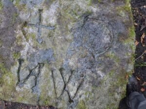
Another point to be made is that modern eyes will see W as a letter of the alphabet, and thus infer a degree of literacy; but this is not an inherent connection, as this photograph of a ‘coffin stone’ (undateable) may indicate. Letters also function as images, even in Western alphabets; this may explain reversals as in the ‘N’ and the possible ‘C’. It appears the carver may have attempted to rectify an error in the reverse N into a M or W Marian mark before giving up − this suggests illiteracy, a striving for something held in the memory rather than something lexically understood. Images can be recognised more readily than they can be executed. Literacy is a left-brain function; symbols, as images, are right-brain. It is known that images impress themselves more recognisably and meaningfully in the mind than words do, and are retained with meaning longer: “pictures automatically engage multiple representations and associations with other knowledge about the world, thus encouraging a more elaborate encoding than occurs with words”.9 The vehicle of transmission of W is visual-symbolic, but the symbol itself is at the interface with language and thus with letters and typography:
The viewer’s subjective impression of meaning from a letter or image is unquantifiable, but is a key feature of typography, whether executed on a page or on a gravestone. As Britannica says: “The typographic page may be considered in terms of two aesthetic qualities. The first of these has been called ‘atmosphere’, ‘feel’, ‘impress’, ‘sense’, and other similar terms. It is easier felt than defined, and it depends in large measure on such things as the size of the block of type, its placement on the page, the kinds of display letters used for titles, running heads, and subheads…”.10 The subjective impression is crucial; lettering is far more than letters, and here it is image speaking to a right-brain understanding.
The appearance on mid-18th century gravestones manifested a kind of synthesis between the traditional Marian mark − that, as indicated on the coffin stone, has also been found on West Yorkshire corpseways, establishing a link with the soul in its passage to the afterlife − and its post-Reformation development as a ‘design’ font arguably acquiring borrowed glamour from its quasi-sacred usage. Use in ‘header’ designs as shown recalls tradition and function while making an aesthetic design statement on the stonemason’s behalf, especially conspicuous when uncrossed Ws are used in the body of an epitaph. Use as a mason’s mark also builds on the Marian usage, being a tradesman’s identifying mark with an added apotropaic value behind it. In both cases, whether consciously intended or not, the inherent apotropaic subtext could be activated by a viewer’s awareness of the tradition. This means the crossed W should be understood as more than a decorative typeface, having a traditionally-established psychological resonance as well as aesthetic appeal, and that these aspects mutually reinforce one another.
In more recent centuries, the design aspect has naturally eclipsed the magical and religious, but the crossed W still makes a clear impact that rarefies it over its workaday cousin, as seen here in the 1920s sign for Aldwych Station − this is the nearest station to London’s esoterically potent Temple Church, and it may be wondered if this fact played a part in the selection of this typeface across the venerable city’s stations. The symbolic value expressed in history adds subtle value informing our appreciation of W as design; it makes it ‘heavy’.
Hence my proposal, that for folklorists it is hard to see W without being put in mind of magical protections, and for others that the letter design itself encodes inherent meanings and backstories that are not immediately apparent within the material composition, but nonetheless, as befits a good metaphor, exert subliminal affect through the crossed W.
Postscript Feb. 3, 2023:
Another line of reflection occurred to me after the publication of this article. Giordano Bruno’s (1548-1600) ‘art of memory’ was a mnemonic technique that employed magical symbols rather than the more mundane tags employed in contemporary ‘memory theatres’. Bruno derived his symbols from astrological and Hermetic sources, consciously in the belief that such images would “help not only the memory but also all the powers of the soul in a wonderful manner” [q in Francis Young, Magic in Merlin’s Realm, CUP 2022 p178]. This conception drew on his belief that images already associated with esoteric meaning would have enhanced influence on the human mind, and as such were equivalent to the sigils drawn on charms and talismans. In other words, such charged image-symbols were magical in themselves and held deep influence on the human mind.
Notes
- Timothy Easton, ‘Ritual marks on historic timber’, Weald & Downland Open Air Musem magazine, Spring 1999:22-30.
- Brian Hoggard, Magical House Protection, Berghahn 2019: 87-90; Matt Champion, Medieval Graffiti, Ebury 2015:55; John Billingsley, Charming Calderdale, Northern earth 2020:51-52,
- Linda Wilson, ‘By midnight, by moonlight: Ritual protection marks in caves beneath the Mendip Hills, Somerset’, in J. Billingsley et al. (eds) Hidden Charms, Northern Earth 2017: 41-51.
- https://www.creswell-crags.org.uk/explore/witch-marks/, acc’d 3 March 2021.
- https://transportedbydesign.tumblr.com/post/124837656839/i-would-like-to-suggest-the-crossed-w-as-a, acc’d 19-2-21.
- Broadly, these styles were based on existing handwriting conventions. In the following, as no kind of specialist, I rely on Wikipedia for these cursory sketches of typographical history in this article, notably: History of Western typography; Garamond; Claude Garamont; Johnston (typeface); W; and other websites on typography, as cited.
- It also does not form part of the Italian alphabet, but is used in its crossed form W as a monogram to express the word viva!.
- http://www.typographicwebdesign.com/choosing-using-fonts/aesthetics-emotions/, acc’d 20-2-21
- C. L. Grady et al, ‘Neural correlates of the episodic encoding of pictures and words’, PNAS 3 March 1998, https://www.pnas.org/content/95/5/2703, acc’d 3 March 2021. Advertisers are well aware of the ‘Picture Superiority Effect’, e.g. https://www.mysimpleshow.com/picture-superiority-effect/, acc’d 3 March 2021.
- https://www.britannica.com/technology/typography/Aesthetic-qualities-of-the-typographic-page, acc’d 20-2-21
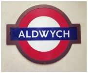
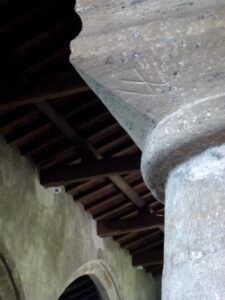
Two examples of the crossed W, old and modern: Aldwych underground station, London, and a Marian mark on a pillar capital in Horton-in-Ribblesdale Church
Published in NE171, March 2023, pp.17-21